Tuesday, 16 April 2013

Final Posters, Magazine and teaser trailer

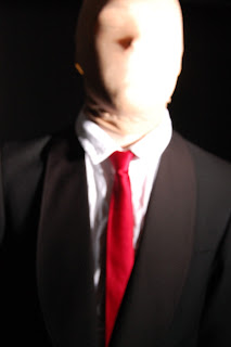
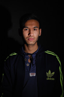
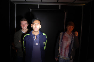
This is all of our final products within one post. We think that our products have been really successful. Also the blog has managed to accumulate over 800 views, whilst the trailer has managed to reach over 150 hits. This makes us feel confidant that we chose a subject matter for our pieace that is prevalant within the public eye and is continuing to gain more notoriety.

Saturday, 13 April 2013

Evaluation Question 3


Here is the third evaluation question. There is also a video to support this, as well as a wordcloud.


Wednesday, 10 April 2013

Evaluation Question 2


This is our evaluation for question 2 "How effective is the combination of your main product and ancillary texts?"Explaining the synergy between our three main texts.

Friday, 22 March 2013

Feedback - Word cloud - WordItOut

Word cloud made with WordItOut

In support of question 3.

Thursday, 21 March 2013

Questionnaires


We couldn't have print screened all of these, but our scanned in copies are a sample of all of these questionnaires.

Monday, 18 March 2013

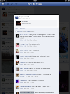
Facebook feedback


Here are some of the comments our trailer received when we posted it on Facebook.

Monday, 4 March 2013

Evaluation Prezi draft

The prezi is almost completed, we just need to incorporate the audience feedback into it.

Thursday, 28 February 2013

Monday, 25 February 2013

Friday, 22 February 2013

End clip for trailer

 
Here is the template of the closing image of our trailer, it needs to have some effects added to it. 

Sunday, 17 February 2013

RedLine Pictures branding

For this we used photoshop to come up with a few designs that could be put at the start of our trailer and possibly on our posters. We started off with the typical font type for a film company's branding but also one that represents that of the psychological horror genre. Also we felt that the colour red was important as it is the colour that represents our genre the most. For the third design we initially wanted a blood effect, but this looked quite amateur so we decided the swipe brush effect would look a lot better.


Tuesday, 12 February 2013

Blog Background

We decided that we wanted to use the magazines as our background for the blog as it felt more personal. Initially we had a tiled portrait of The Slenderman, but we had found that on the internet so wanted to personalise it.

Monday, 11 February 2013

Further enhanced main poster

We have just decided that the title will look better at the top of the page.

Enhanced final poster

The bottom text needs to be tweaked, and Redline Pictures' logo needs to be inserted in the bottom. Additionally, we have used photoshop as opposed to taking a location shot, to black out the background.

Magazine final cover

Here is our final magazine cover. We have decided to keep the font in front of The Slenderman's face, as it still makes him seem concealed. Ordinarily characters appear over the front of the magazine title, we've opposed this and put him behind the text so it is evident he is always hidden. The date is a september addition to build up an atmosphere around the halloween release.

Magazine Front Cover Inspiration

Due to are character showing a resemblance to that of the character of the Hitman movies, We decided to take a look at how they created there posters and magazine front covers.
From this we already knew that it was a successful formula that already worked. As this one is a poster we decided that it would  be better for us to do a close up head shot of the Slenderman for our magazine. We also wanted to re-create a certain amount of the lighting that is shown in the picture above. Also we thought it was important that the tie would stand our and contrast giving us a clear attraction point to our magazine.  

Inspiration for individual posters

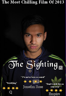
Once we had decided that we were going to attempt to create individual posters for each of us, we thought it was important to gain inspiration from existing posters. we started off by looking at individual posters for the twilight movies.  

From this, we discovered that the individual posters aren't cluttered and don't look like the the group poster(a mid/close up shot of one person). An important part of it is to give a sense of the character, but also not give to much away other than the name. This would mean that the audience is already aware of the character so they can make a pre-determined decision on them but are willing to have their mind changed.    

After this we decided that it would be beneficial for us to look at other genres such as action and adventure. This meant we could make an informed decision about how we were going to create it. Also with this we could obtain other ideas of how to create it. we started by looking at the Harry Potter individual posters.   

As Harry Potter is already a well established franchise it meant that we are unable to create a poster with this little text. What this does show us though is a different way to do are posters.

overall, as the genre is the same it makes sense for us to create our posters in the same way as the Twilight film poster but we can take camera angles and shot types from the Harry Potter poster.

Monday, 4 February 2013

Chris Final individual Poster


Jack Final Individual Poster


Edited individual photo's


 Here are the individual photo's that we have edited to make the lighting more suitable for the individual photos.

Colin Final Individual Poster

Here is the final individual poster of the character Colin. As with all the individual posters, we have edited the photos and altered lighting and logo's that contrast with the title. Moreover, we have removed the ratings and stars and are just using them in the final main poster.

Bruce individual Poster, Final


Here is a final edition of Bruce's individual poster.

Wednesday, 30 January 2013

Magazine Photo Idea Draft

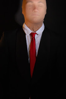
This is the picture for the magazine. This was all created on a iPad, using "Snapseed" to create the texture and colour.

"iPhoto" to soften the tones of the face, to create the "no face" look.

"Phonto" to make the title.

Editing potential magazine photos on iPad

Top two images show the short process of using the soften tool, this will help remove the details of the face under neither the mask. The bottom two images are the before and after of the editing.

Monday, 28 January 2013

Group draft Poster

Here is a draft poster, which will be our main poster. However, we are considering taking another location shot for this poster.

Bruce Draft Poster


Chris Draft Poster


Jack Draft Poster


Colin Draft Poster

Here is a draft poster for the character Colin

Magazine/ Poster Photoshoot


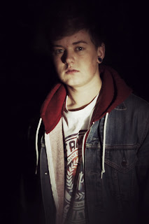
Here are a few  of the shots we took in the photography studio at college, these will then be applied to our posters and magazine.

This shoot is what we are going to use for our Magazine/Posters. This shoot was very effective because it shows different characteristics of each character, being jokey, serious or scared. It was all taken into consideration.